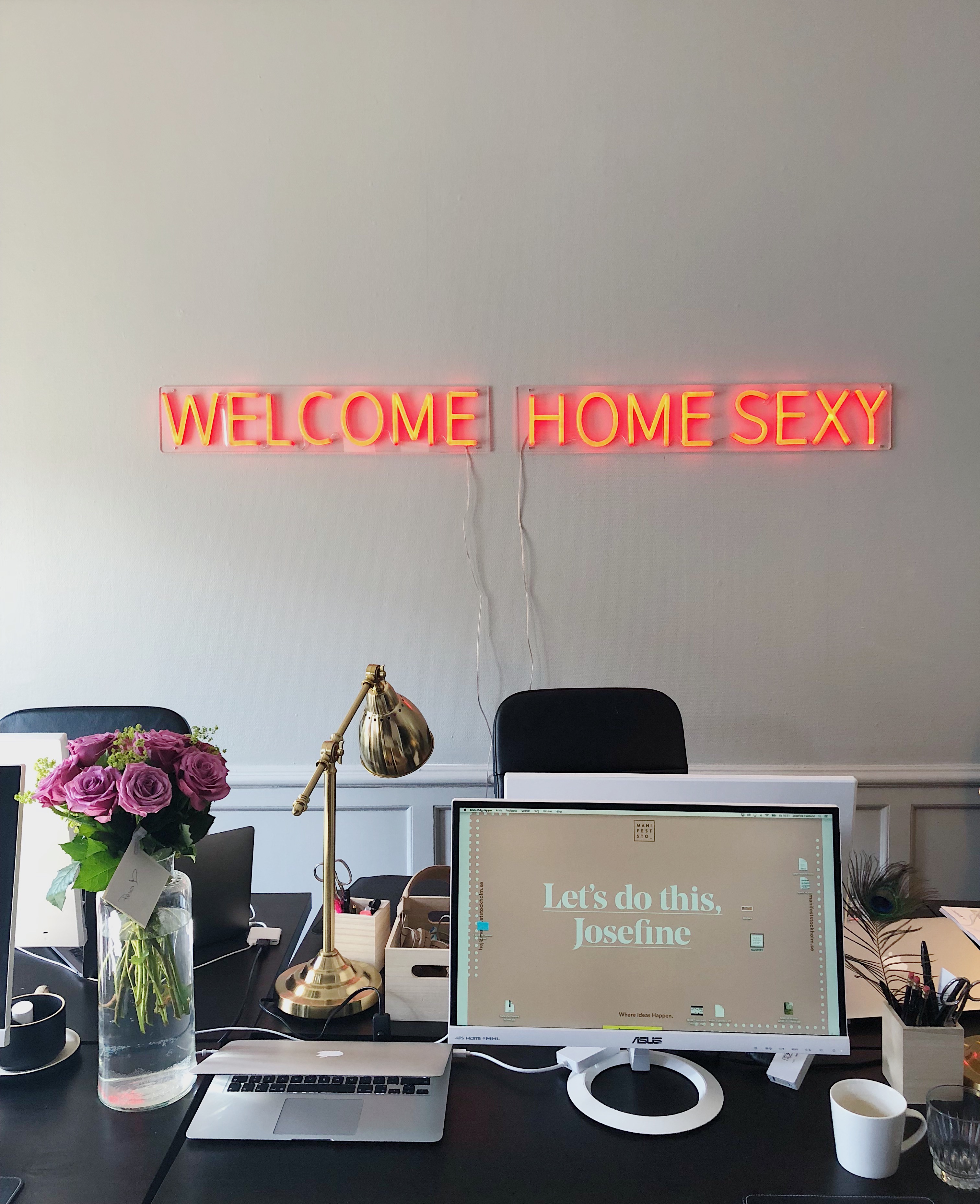
Manifest’s got a brand new tote bag
Manifest Brand Portal
Updated 06.08.2024
Hello
Welcome to the Manifest brand portal. This is a guide to our brand, what’s available to you and how to use it.
Our brand is here to elevate the vernacular. To let the work do most of the talking. We’re not going to dress things up and be fluffy — we’re older, wiser and more confident and we need our brand to show it.
Contents
1.1.1 USING OUR LOGO
1.1.2 LOCK-UPS
1.1.3 CO-BRANDING
1.1.4 PROFILE PICTURES & FAVICON
1.1.5 SIZING
1.1.6 BOILERPLATES & SIGN OFFS
1.2.1 PRIMARY PALLETTE
1.2.2 SECONDARY PALETTE & TINTS
1.2.3 COMBINING COLOUR
1.2.4 APPLYING TINTS
1.3.1 BRAND FONTS
1.3.2 HIERARCHY
1.3.3 KERNING
1.3.4 ALTERNATIVES
1.4.1 THE EM DASH
1.4.2 NOUVEAU REBUS
1.4.3 LOZENGES
1.5.1 LAYOUTS
1.5.2 SIZING LOGOS & LOCK-UPS
2.3.1 OUR NAME IN TEXT
2.3.2 DOS & DONT'S
3.1.1 PHOTOGRAPHY & FOOTAGE TYPES
3.1.2 PHOTOGRAPHY & FOOTAGE PRINCIPLES
3.1.3 EXAMPLES
3.1.4 TEAM HEADSHOTS
3.1.5 ILLUSTRATION
3.1.6 CHOOSING & USING STOCK
3.2.1 LOGO ANIMATION & STINGS
3.2.2 TYPE ANIMATIONS
3.2.3 OTHER ANIMATIONS
3.3.1 AUDIO PRINCIPLES
3.3.2 CHOOSING & USING STOCK
3.3.3 EXAMPLES
7.1.1 LOGO
7.1.2 EPISODE ASSETS
7.1.2 SOCIAL ASSETS
7.2.1 LOGO
7.2.2 EPISODE ASSETS
7.2.3 SOCIAL ASSETS
7.3.1 LOGO
7.3.2 IDENT
7.3.3 EMAIL ASSETS
7.3.4 SOCIAL ASSETS
7.4.1 LOGO
7.4.2 EMAIL
7.6.1 LOGO
7.6.2 SOCIAL ASSETS
7.6.3 INVITE ASSETS
8.1.1 PROFILE PICTURES & BANNERS
8.1.2HIGHLIGHT COVERS
8.2.1 WORK
8.2.2 CULTURE
8.2.3 RECRUITMENT
8.2.4 SEASONAL
8.2.5 AWARDS
8.2.6 NEW CLIENTS
8.2.6 NEW CLIENTS
8.2.8 THOUGHT LEADERSHIP
8.2.9 NEW STARTERS
8.2.10 NEW STUDIOS
8.2.11 COVERAGE
10.2.1 BRAND IDENTITY OVERVIEW
10.2.2 LOGO
10.2.3 BRAND IMAGERY
10.2.4 PRESENTATION DECKS
10.3.1 BRAND IDENTITY OVERVIEW
10.3.2 LOGO
10.3.3 BRAND IMAGERY
10.3.4 PRESENTATION DECKS
Section 1
Brand Facets. The building blocks of our brand.
1.1 Our Logo
The Manifest logo is a strong, simple signature for our brand. It’s bold and straight to the point.
Our Logo should be used primarily in black or white although there are times it can work in specific colours.
1.1.1 Using our Logo
Main Use
There are 2 main ways to use our logo - really fucking big or as a sign-off / endorsement.
We’ll discuss exact sizings in the Grids & Layouts section.
Misuse
Don’t half-way house the logo - either make it big or keep it small.
Don't use the Manifest logo more than once on any piece of collateral or presentation slide.
Logo as Endorsement
We use our logo in endorsement lines too - here’s a few examples. These should be used more as a support mechanism (such as on the Slant emailer that has its own branding).
1.1.2 Lock-ups
Lock-ups are when we need something a little different. We use these to embellish some of our content rather than use in place of our logo (eg. Interstitials).
These shouldn’t be confused with Boilerplates (which we’ll come to soon).
There are 2 types of lock-up — Stacked and Roundel

Stacked Lock-ups
There are 3 variations of the stacked lock-ups, each subtly different from the last.

Construction
For all of the stacked lock-ups, we use the word mark as our base and size accordingly.
Sizing and spacing should be based on the baselines of the logo and text (i.e. where the M sits rather than the S).


Roundel Lock-up
We’ve also created a roundel lock-up to use in places where a stacked lock-up might not work.

1.1.3 Co-branding
Sometimes we’ll need to show our logo next to another brand. As everyone’s logo is different, there are no hard and fast rules here, just some basic pointers.
Construction
As with the lock-ups, we use the cap height of the word mark as our base, with everything aligned to the middle.
Client logos are sized according to its proportions, sitting at least 200% away from the X - these should be positioned on a case by case basis.
If you’re laying out a collab logo on an asset, the X should be centred.


1.1.4 Profile Pictures & Favicon
The strength of our word mark means that it can work well as a profile picture for all social platforms, with a few exceptions.
Profile Pictures
Our profile pic is designed to be used square, rounded square & circular profile pics.

Small use
For platforms where our logo is seen quite small or with no real public profile page (eg. Slack), use our stacked Wordmark.

Favicon
At some point, our logo won’t be legible in which case, our favicon should be used.

1.1.5 Sizing
A quick rule of thumb on what logo to use at what size.

1.1.6 Boilerplates & Sign-off
More experimental in look and slightly more complex than our standard lock-ups, we use boilerplates and sign-offs mainly on swag or as a short-hand signature.
Boilerplates — Wordmark
We only use a truncated version of our name for boilerplates and our logo shouldn’t be anywhere near it.

Boilerplates — Types
There are 2 types of boilerplates - large and small. Each one uses the truncated word mark as its base and can include up to four lines of text.

Boilerplates — Alignment
For each type, you can experiment with the alignment of each line depending on the word mark you use.
You can switch from centre aligned to fully justified.

Sign-off
Our sign-off sits at the end of our corporate collateral (pitch decks, website, emailers etc.) and can either be used on its own or with our studios sat underneath.
Sizing-wise it should be as wide as it can be.


1.2. Colour
Our default palette is black and white with 6 grey swatches to add depth and 7 secondary colours for expression.
1.2.1 Primary Palette
Note: Mid Grey 1, 3 and Light Grey are not pre set in Keynotes and are used only in data charts.
Black
R: 0 G: 0 B: 0
#000000
C:0 M:0 Y:0 K:100
White
R: 255 G: 255 B: 255
#FFFFFF
C:0 M:0 Y:0 K:0
Dark Grey
R: 67 G: 67 B: 67
#434343
C: 0 M: 0 Y: 0 K: 74
Mid Grey 1
R: 102 G: 102 B: 102
#666666
C: 0 M: 0 Y: 0 K: 64
Mid Grey 2
R: 118 G: 118 B: 118
#767676
C: 0 M: 0 Y: 0 K: 54
Mid Grey 3
R: 153 G: 153 B: 153
#999999
C: 0 M: 0 Y: 0 K: 34
Light Grey
R: 204 G: 204 B: 204
#CCCCCC
C: 0 M: 0 Y: 0 K: 24
Off White
R: 244 G: 244 B: 244
#F4F4F4
C: 0 M: 0 Y: 0 K: 14
1.2.2 Secondary Palette & Tints
Our expanded palette brings the colour, but we try to be sparing with it, using it for moments of emphasis.
Tints
Secondary colours can be tinted in 20% increments.
Pantones
Pantone swatches selected are the closest match via pantone.com and may vary from on-screen appearance.
Blue
R: 10
G: 69
B: 206
#0a45ce
C: 95
M: 67
Y: 0
K: 19
PMS 2132C
Sky Blue
R: 166
G: 228
B: 253
#a6e4fd
C: 34
M: 10
Y: 0
K: 1
PMS 9464C
Green
R: 2
G: 97
B: 75
#02614b
C: 98
M: 0
Y: 23
K: 62
PMS 336C
Peach
R: 252
G: 220
B: 197
#fcdcc5
C: 0
M: 13
Y: 22
K: 1
PMS 9200C
Orange
R: 252
G: 92
B: 64
#fc5c40
C: 0
M: 63
Y: 75
K: 1
PMS 171C
Pink
R: 239
G: 190
B: 255
#efbeff
C: 6
M: 25
Y: 0
K: 0
PMS 243C
Yellow
R: 242
G: 186
B: 79
#f2ba4f
C: 0
M: 23
Y: 67
K: 5
PMS 2006C
1.2.3 Combining Colour
34 colour combinations have been created for immediate use, all based on our primary and secondary palettes.

Primary, Dark
Aa
Black
White
Aa
Black
Off White
Aa
Black
Mid Grey 2
Aa
Dark Grey
White
Aa
Dark Grey
Off White
Primary, Light
Aa
Off White
Black
Aa
Off White
Dark Grey
Aa
Off White
Mid Grey
Aa
White
Black
Aa
White
Dark Grey
Aa
White
Mid Grey
Secondary, Blue
Aa
Blue
Sky Blue
Aa
Blue
Pink
Aa
Sky Blue
Blue
Aa
Blue
Peach
Aa
Blue
Yellow
Aa
Sky Blue
Green
Secondary, Green
Aa
Green
Peach
Aa
Green
Pink
Aa
Green
Yellow
Aa
Green
Sky Blue
Secondary, Peach
Aa
Peach
Green
Aa
Peach
Orange
Aa
Peach
Blue
Secondary, Orange
Aa
Orange
Peach
Aa
Orange
Yellow
Aa
Orange
Pink
Secondary, Pink
Aa
Pink
Green
Aa
Pink
Orange
Aa
Pink
Blue
Secondary, Yellow
Aa
Yellow
Green
Aa
Yellow
Orange
Aa
Yellow
Blue
Bad Colour Combos
When combining colours, legibility is key. If it’s hurting your eyes then it’s probably not a good combo.

Colours in action
Try to stick to using these colour slides for statements or dividers so that they have more impact.
Note how you can utilise the tints on the bottom right slide to highlight words - great for signposting & transitions.

1.2.4 Applying Tints
Tints in Action
Tints can work differently depending on your background colour.
Dark backgrounds have the tinted text set at 60% of that colour.
Light backgrounds have the tinted text set at 60% of the foreground or text colour.
This gives a more subtle result whilst also being more legible.

Tints No-Nos
Here’s what happens if you use the wrong tints.
Don’t do any of these.

1.3 Typography
A versatile Grotesque font with the spirit of a display font, this timeless Sans is robust, elegant and clean, giving us great legibility at scale.
1.3.1 Brand Fonts
Neue Montreal Semibold
Used for headlines & bold statements.
Note: Please ensure you have the correct version of the font installed - it has rounded full stops & bullets.

Neue Montreal Regular
Used for statements & body copy.
Note: Please ensure you have the correct version of the font installed - it has rounded full stops & bullets.

1.3.2 Hierarchy
Headlines
Here’s a quick handy guide for when you need to use different type sizes.

Headers
Headers adopt the same characteristics as headlines - we’ll go through these in a bit more detail in the Grids section.

1.3.3 Kerning
Kerning equalises the space between between letters. Here’s how we kern all our type.
Note: the example shows how our type looks in design software rather than something like Keynote.
The rule of thumb is that Kerning should be a little tighter than the default on everything set in Semibold.
In the Adobe suite, that means setting the leading to ‘Optical’ - it gives more even spacing whilst condensing the whole headline.
In Keynote, it just means changing the Character Spacing to -2%.


1.3.4 Alternatives
There are places that our brand font won’t be able to be used. In those cases, here’s a list of alternative typefaces, where to source them and where to use them.
Neue Haas Grotesk
Available through Adobe Fonts
Use in:
Manifest branded Emailers

Helvetica Neue
Available on every Mac
Use in:
G Suite
Mac Mail or similar

1.4 Graphic Devices
To embellish our brand aesthetic, we use a few different graphic devices. This creates a red thread that runs through all of our comms, ensuring everything looks like it's from us.
1.4.1 The Em Dash
WTF is an Em Dash
An em dash is a punctuation mark that can be used to replace commas, parentheses, colons, and semicolons.
The name comes from typography—the work of setting, arranging, and printing types. An em dash is a dash that is the width of an M.
In general, the em dash is seen as being more interruptive or striking than other punctuation, so it is often used stylistically to draw a reader’s attention to a particular bit of information.
It’s for these reasons we use the em dash within our brand.

In Text
When writing, the Em Dash should be a default choice as opposed to a hyphen or parentheses but only when you need to break a sentence and draw attention to the reader — don’t use it to double barrel anything, the hyphen is fine for that.
We also use it at the start of a headline on our website or at the start of a large leading paragraph.
We tend to avoid using these in Keynote presentations due to the sheer amount of effort this would take to police.

As a graphic device
We also use the Em Dash to hold imagery and although we’re playing fast and loose with the shape (yes, it’s a rectangle), we’re calling it an em dash and sticking with it.

1.4.2 Nouveau Rebus
The design approach is named for its similarity to the Rebus, a style of word puzzle that combines illustrations with individual letters to depict words or phrases.
We use this device in 2 ways — to add additional context to written copy or, more conceptually linked and to lighten the mood, by adding emojis to the end of a sentence or word.

1.4.3 Lozenges
We also make use of lozenges to pull out pieces of text. These are sometimes interchangeable words, like our studio locations or dates of an event.
When sizing a lozenge, the outer shape should be the height of line of text that it is included in. The text is then sized at 60%, with a padding left and right of 55%.
Text should be in all caps.
Stroke weight depends on the overall size but 2pt is a good rule of thumb.

1.5 Grids & Layouts
We have numerous layout systems, all based on a few common factors. We’ve touched on how we treat typography already, but now we’ll get into a bit of detail with using text as a baseline grid, how to add columns and how to size our logo on an asset.
1.5.1 Layouts
Constructing a layout — Margins
We start by creating a margin within the asset we’re creating. There are 2 options, a narrow margin or standard margin.
Narrow margins are set at ≈3%* of the shortest side of the asset and should be used, typically, for on-screen assets.
Standard Margins are set at ≈3%* of the longest side of the asset and should be used, typically, for printed assets.
* When working in Pixels, round up or down as required (you can’t have a fraction of a pixel).

Constructing a layout — Baselines
Now let’s add some horizontal lines so we know where to add text.
Baselines are set using the rules created for headlines and can be set at 6, 8, 10 or 12 baselines depending on use.
These apply for all orientations - landscape, portrait & square.
Choosing the right baseline depends on the length of text you’re working with.

Constructing a layout — Columns
Finally, we add columns. This gives us our layouts rigidity but also flexibility when adding imagery.
Our underlying Grid is 12 Columns and we use these in various ways.

Constructing a layout — Examples
Grids shouldn’t be limiting and you should mix up elements to create variety.
With a choice of baselines and the freedom 12 columns gives you, there are more examples that are shown here so go nuts (although try not to mix it up too much so that your assets look inconsistent)

1.5.2 Sizing Logos & Lock-ups
Sizing our logo on an asset — In Isolation
Sizing our logo in isolation on an asset depends on 2 things - the baseline you use and the actual size of the asset.
The basic rule should be that it spans 2 baselines high at a minimum. If that’s not possible (see fig.1) it should be sized to the width of the margins.
NB. There is an exception here — if you want a big impact on a hard cut, alway opt for the full width logo, no matter what grid you’re using.

Sizing our logo on an asset — As Endorsement
Sizing our logo as an endorsement works on if the asset is portrait or landscape.
If the asset is square, apply the portrait rule.

Sizing a lock-up as an end frame
Sometimes we’ll use a lock-up as an end frame on an asset. These are all sized the same way - based on a square 12 baseline grid and scaled to the shortest side of your asset.
The logo is sized to one baseline, then the whole lock-up should be aligned centrally.

Sizing the collab lock-up
When creating a new client collab asset, there are two layouts - one for portrait & square and one for landscape.
Landscape assets use the logo sized from a 12 baseline, Square & Portrait use a 17 baseline.
Use the logo as the basis for sizing everything else.

Section 2
Brand Voice. How we speak & how we write.
2.1 Our Brand Personality
We are...
Playful
We might sometimes look serious but we have a playful side too. It’s about not taking ourselves too seriously, dropping in the odd emoji and random pop culture reference.
Positive
Our industry is always quick to punch down — we work hard and we’re nice to people. We see the best in others and champion our peers.
People
At our core, we’re all human. We don’t use buzzwords (seriously) and we try and make sure everyone understands what we’re saying.
We are not...
Silly
There’s a fine line between playful and silly. Whilst we’re passionate and nerdy, we’re never goofy — we’re professionals at the end of the day and we should always show that.
Snarky
No one gets anywhere with negativity. We’re all about creating a positive culture — not just in our agency but throughout our whole industry. Be Darryl Sparey.
Self-obsessed
Yes we do great work and, yes, we should laud it. But we should never navel gaze. Us looking good is just a by-product of what we do, not the reason we do it.
2.2 Colloquialisms
We all love a pun. And there’s nothing punnier than punning your own agency name into everyday use. Here’s a quick overview of what we use and the correct way to use them.
Mani-Slang — The Basics
Spread the word
For these, we use the full word and add a bit at the end.
Eg.
Manifestival
Manifestivities
Manifestee
I can make you a Man
The obvious puns. Where the work is pretty much all done for you.
Eg.
Maniversary
Manalytics
Give 'em both barrels
Basically a marriage of two words, hyphenated.
Eg.
Mani-fam
Mani-slang
Mani-Slang — Examples
Manifestival
—The annual Manifest innovation conference.
“See you at Manifestival!”
Manifestivities
— Season cheer, Manifest style
“Enjoy the Manifestivities!”
Manifestee
— A person who works at Manifest
“Once a Manifestee, always a Manifestee”
Maniversary
— A Manifest work anniversary
“Happy Maniversary!”
See also the truncated “Happy Mani”
Manalytics
— Internal Data analysis
“If you look at the Manalytics, you’ll see a real thirst for knowledge”
Mani-fam
— Collective term for the Manifest team
“Welcome to the Mani-fam”
Mani-Slang
— This whole section
“Apologies for the Mani-Slang, I’m just really excited”
Mani-swag
— Manifest branded collateral
“Sorry, can’t talk, trying on my fresh Mani-swag”
2.3 How we write
A few general pointers when writing for Manifest. It can be tricky to get it right straight away so be sure to check with others before sending anything out.
2.3.1 Our name in text
We want our name to stand out but not shout out, so when we write our agency name in copy we set it in Title Case.
Manifest not MANIFEST
and definitely not
manifest.
2.3.2 Dos & Dont's
Do...
👉 Be Direct
Don’t over dress your language. Get straight to the point and don’t get too fluffy.
👉 Think
Pause. Breathe. Write. Don’t knee jerk react to anything. Be conscious about what you put out there. Think.
👉 Play nice
That means not calling anyone out. Not sub-tweeting. Nothing. Stay positive.
Don't...
👎 Make Fetch Happen
LinkedIn doesn’t need anymore buzzwords so let’s not add to the pile. If you’re going to use a colloquialism, make sure it’s an obvious pun, otherwise don’t bother.
👎 Be a Bitch
No snark. No subtweets. Good vibes only.
👎 Fuck about
You don’t want to find out.
Section 3
Art Direction. Why we look the way we look.
3.1 Brand Imagery & Footage
Whilst we don't have any specific brand photography, we do adorn our communications with imagery. The following section gives you a good idea of what to use and where.
3.1.2 Photography & Footage Principles
We have four different photography types that we use throughout our brand.
Brand
From signage to screens to swag, it’s our brand in the real world. We use these in our keynotes, for generic press releases and on social media when we’re not talking about a specific service or campaign.
People
Our Manifestees — the people who make our agency what it is. We have two different styles, candid and standard headshot.
Environment
Our studios and surrounding areas. Used when talking about our global offering.
Abstract & Stock
Used when the other 3 just don’t fit. Used for generic backgrounds and in Keynotes when applicable.
3.1.2 Photography & Footage Principles
Our photography & footage should always give a sense of at least 3 of the following principles (not Abstract though, that’s just silly).
Community
Culture
Creativity
Positivity
Confidence
3.1.3 Photography & Footage Examples
Brand
If creating new visual mock-ups, try to use ones that have a similar style (preferably from the same collection or mock-up site)


People
Whilst lighting will differ on each location and each shoot, the style for all should remain consistent.
‘Culture’ shots should feel candid and informal with no one looking at the camera.


Environment
For interior shots, try to ensure there’s no clutter and loads of light. External shots should be well lit — try to avoid anything heavily graded if using stock.
Note: Shots chosen with the old branding are to how style & composition only - the rest are stock imagery and can be used until official photography is done.


Abstract
Abstract shots are mainly used for placeholders in Keynote decks. Crop tightly to avoid anything looking too ‘stocky’.


Distortion
While a handful of these are stock, we’ve been developing our own versions of these and have built out a fuller library for use in Keynotes and for generic brand outputs.


Stock
When using Stock imagery for something, try and stick to the same collection, photographer or style for consistency.
Our default library is Death to Stock.


3.1.4 Team Headshots
Styling
For consistency in decks and on our website, headshots should be shot like this.
Shoot pointers
Clothing — bold colours are fine but avoid complex patterns as they can cause unusual effects at scale. Try not to date your shot by wearing anything too seasonal (ie thick coat or a summer vest).
Try to pick a clear, bright day so there’s a lot of natural light.

Cropping
For consistency in decks and on our website, headshots should be cropped like this.
Original
Can be shot on level ground — straight on.
Should have a shallow depth of field — only the subject in focus.
Cropped
Leave a small gap above the subject’s head and crop at the chest.
Crop dimensions for website: 2560 × 2108px


3.1.5 Illustration
Editorial
Sometimes we use illustrations to convey more complex concepts. Whilst our style is still a WIP, the general feel is modern, chunky and playful.
The default should be monochromatic, with colour added depending on where it’s being used.

Iconography
Sometimes we use illustrations to convey more complex concepts. Whilst our style is still a WIP, the general feel is modern, chunky and playful.
The default should be monochromatic, with colour added depending on where it’s being used.

People
We’ve also developed a suite of Manifestee illustrations — powered by Open Peeps.
You can use these for social avatars or on your Slant profile.


3.1.6 Choosing & Using Stock - What to Avoid
With a finite amount of owned imagery, we’ll sometimes need to use stock photography. If we do that then we need to make sure it blends in with our brand imagery.
Here’s a few pointers when choosing stock.
People
Avoid people’s faces. Avoid anything you’ve seen on LinkedIn.
Environment
Avoid anything heavily graded. Avoid using anything that feels overused or just plain ‘stock’ avoid using anything that doesn’t give a feel for the city’s culture.
Abstract
Try to crop these images tight. Avoid anything that looks too structured or homemade (marbled paint etc.)


3.2 Motion
When it comes to motion work, we like to keep things simple. No complicated effects or techniques — we’re deliberately basic so that our content takes centre stage.
Our two main principles are hard cuts and linear slides.
3.2.1 Logo Animations & Stings
Logo animations also double up as interstitials — breaking up content in hypereels or acting as end frames in a piece of content.
You can use these as is or modify the text to suit whatever you need to say.

3.2.2 Type Animation
When it comes to animating text, simplicity is key. Remember, if we have text in a piece of footage it’s so it can be read — over animating it can often overwhelming.
Our preferred method for animating long sentences word is word rather than by letter.
3.2.3 Other Animation
Other videos at your disposal to use in social assets or in keynote presentations.
3.3 Audio
Audio is just as important to our assets as motion and adds real depth to our communications. Here's how to get the right vibe.
3.3.1 Audio Principles
Audio choice will always differ per video due to what we’ll need each video to do, but it should align with some of the following attributes.
* When we say Serious we just mean not some shit like the Wiggles.
Positive / Upbeat
Modern
Serious*
Expressive
3.3.2 Choosing & Using Stock
A few pointers for getting the best audio for brand footage
Instrumentals FTW
Instrumental tracks are definitely the easiest to work with. Tracks with lyrics aren’t exactly vetoed but the vocals shouldn’t get in the way of the footage.
Our go-to genres
Jazz, Hip-Hop, Electric are our vibe. We sometimes use the odd rock tune, but it’s usually an instrumental version of something well known or something with a pop-punk feel.
Don’t go full Warp Records
Whilst we all love a good ambient tune, try not to pick anything too glitchy or weird. Anything that sounds like Autechre or Aphex Twin basically.
Stop. Hammer time.
Tracks with a natural break lend themselves really well to videos that need a piece of audio highlighting AKA The White Zombie Rule.
3.3.3 Examples
Here’s a few tracks we’ve used before and are a good example of the type of tracks we should be using.
Best of Your Todays — Ruslin
Hip Hop. Minimal. Serious.
Combine — Dan Deacon
Electronic. Upbeat.
It’s a Fast Life! — Frank Bentley
Hip Hop. Powerful. Serious.
Gotta Love — Yulee
Soul & RnB. Jazz. Upbeat.
Bokeh — Soundroll
Lo-fi. Carefree. Serious.
Come True — A.M. Beef
Electronic. Pop. Retro.
Good Foot — Risian
Electro. Funk. Retro.
Go with the Flow — QOTSA
Rock. Upbeat. Serious.
United States of Whatever — Liam Lynch
Rock. Upbeat. Playful.
Revolusion — Elliphant
Electronic. Upbeat.
Swing — Peyruis
Electronic. Swing. Upbeat.
Stand Up — The Prodigy
Electronic. Carefree. Upbeat.
Section 4
Corporate Stationery. Official documentation.
4.1 Business Card
Standard Spec
4 colour print both sides
300 / 350gsm uncoated white stock
Premium Spec
Front — GF Smith Colorplan White Frost 175gsm. 4 colour print.
Reverse — GF Smith Colorplan Ebony 175gsm. White foil.

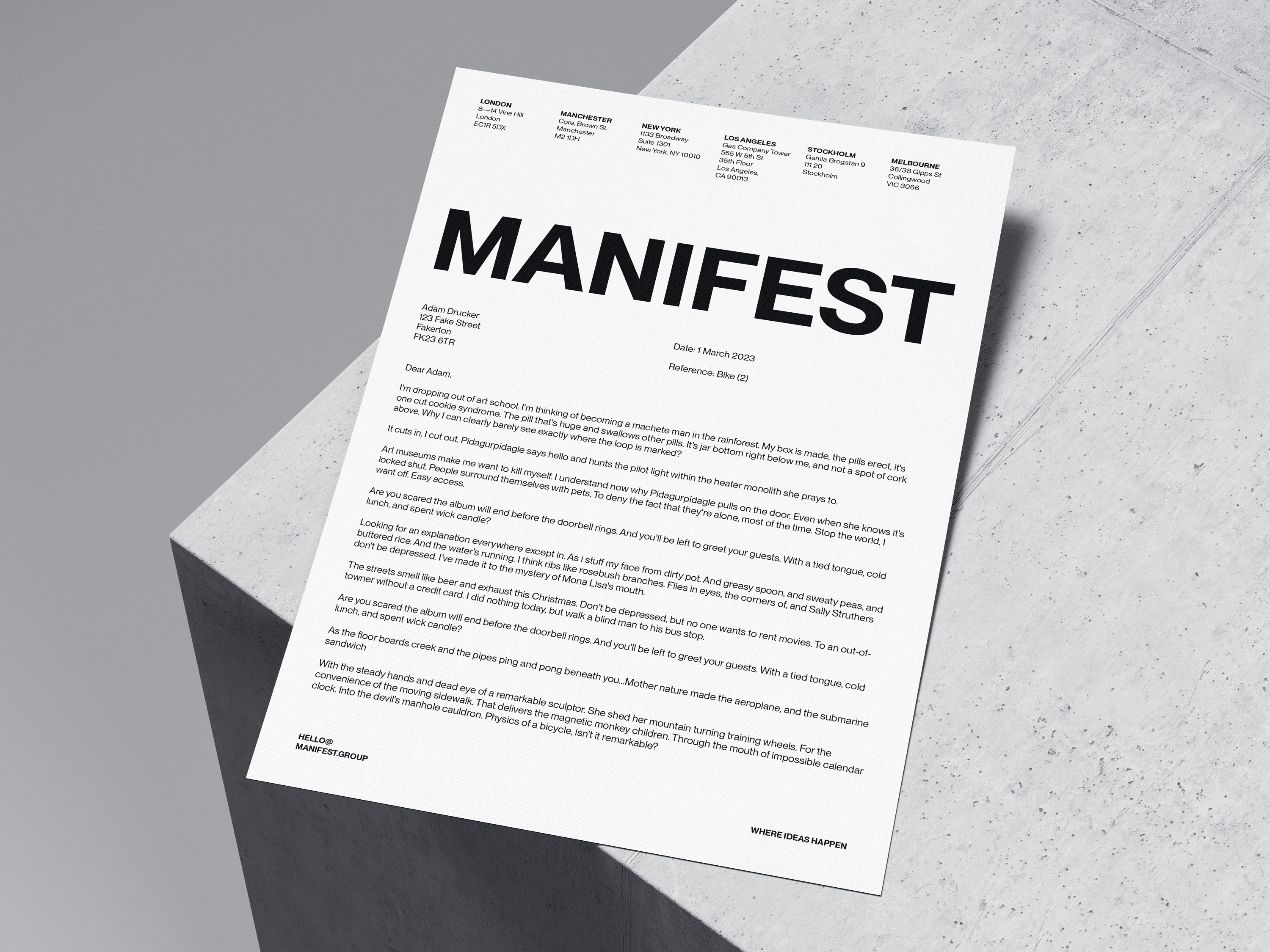
4.2 Letterhead & Compliments Slip
Our Group Corporate Letterhead has been designed to double up as a compliment slip.
Simply cut off the bottom 2/3 of the letterhead and use the top 1/3 as your compliment slip.

4.3 Email Signature
Our email signatures have been built with everyone in mind. You don’t have to include everything that’s here - just what’s relevant to you).
Full instructions on how to add to your email can be found here.
If you’re lucky enough to jet set from studio to studio, we recommend setting up a signature for each studio / timezone and switching to each when you travel.
Timezones should be based on where you are in the world and give recipients a good idea on the speed of responses (rather than writing out ‘this is a good time for me’ spiel.
Logo set as text to reduce amount of images overall.
Visit - links to website.
Follow - links to Manifest Linktree.
Subscribe - links to newsletter signup.
Latest award wins - unified, global awards look the most impressive - try and keep to latest 3
Accreditation logos. See instructions on how to add. London Living Wage is UK specific. Blueprint is also a UK based initiative.


Section 5
Wayfinding & Signage. Getting the internal (and external) vibe right.
5.1 External Signage
Logo Signs
External signing should be approached on a case by case basis but the general rules for sizing are illustrated here.
The logo should be sized 90% width for square or portrait signage and 40% height for landscape signage.


Window Graphics
Window graphics have been designed for ground-level, public-facing studios but can be adjusted to suit any window space.


5.2 Internal Signage
Wayfinding can be modified to suit each studio.

5.3 Ordering Neon
When ordering neon, don’t feel restricted or compelled to use the brand font. Whilst the message should remain the same, the execution should feel right for your studio aesthetic and location.

Section 6
Internal Documentation. Keynotes and that.
6.1 Keynote Templates
We have a wealth of Keynote templates available for you to build out presentations. Because ‘themes’ open as blank, one page documents, all of the following docs have been saved as full keynotes. The original files are locked for editing in Dropbox so just duplicate or download a copy before working on them.
You can find the main Manifest Theme and the locked templates below. If you happen to spot anything erroneous or have a build to add to one of them, please let us know.
Here's a bit of a list of what's available - note that the folder might be more up-to-date than this list.
Deck Building
Modular templates to build a pitch response or send creds etc.
Creds Deck
Pitch Response
Case Study Template
Client Logos
Elemental Team Structure
Rate Cards
Social Media Mockups
CX Innovation Mockups
Ideation & Iteration
Branding & Design decks + conceptual ideation templates
Brand Playbook Overview
Brand Playbook Workshop
Brand Playbook Output
Brand ID Workshop
Design Concept Feedback
Ideation Template
Other Useful Decks
Stuff that gets used often but would be a pain to create from scratch
Priority Deck
Team Engagement
Bezel PNGs
Awards Entry Template
What Rocked
Leadership Templates
Useful Decks for the Leadership teams
Down—Low Live
6.2 Pages Templates
Pages templates thankfully work a lot like Word templates and open as new, pre-designed files ready for saving. We’ve tried to include everything that was there before but if there’s anything missing, please shout and we can create something.
All templates are designed for Group as well as every local studio and can be found here.
Here's a bit of a list on what's available - note that the folder might be more up to date than this list.
Master Documents
Blank Versions to create a document from scratch
Document Template (Portrait)
Document Template (Landscape)
Letter Template (Portrait)
Letter Template (Landscape)
Briefing Templates
To be used to draft briefs internally
Design Brief
Digital Brief
Photography Brief
PR Brief
Website Brief
Client Documents
For CX use
SOW
NDA
New Client Form
Corporate Documents
Grown-up docs
Manifest Corporate Letterhead
Internal Documents
Misc docs
Job Specs
Award Entry
Website Case Study Copy
Meeting Documents
Docs for meetings (internal & external)
Meeting Agenda
Contact Report
New Biz Onboarding Agenda
New Biz Debrief
Press Documents
Docs to send to press
Press Release
Supplier Documents
Third party documents
Influencer Contract
6.3 Numbers Templates
We’ve also created a Manifest branded numbers template - it’s very basic and just shows you the colours to use for data sets etc.
6.4 Word Templates
If you want to keep using Word for documents, we’ve created all of the documents you need (things like Press Releases are best here as most journalists won’t have Pages).
6.5 Google Docs
Due to popular demand, we now have a suite of Manifest Branded Google Suite Documents. Within, you’ll find the Letter and Document templates (a la Pages / Word), Slide Template (a la Keynote) and a spreadsheet (a la Numbers). The files should be 'view only' but you can duplicate these and create your own.
Please note, G Suite documents should be the last resort - Keynote, Pages and Numbers are all collaborative should your client be cool enough to have a Mac.
6.6 Slack Profile
For our Slack profile we use the stacked version of our logo.
You can also customise your Slack to use Manifest branded colours - just copy and paste the below into your Appearance Settings in the app.
#000000, #000000, #202020, #FFFFFF, #000000, #F5F5F5, #F5F5F5, #767676, #000000, #F5F5F5

Section 7
Services & Innovations. How our owned media looks.
7.1 Fresh Meet
Fresh Meet is Manifest's freewheeling podcast where great minds meet to discuss the freshest topics in marketing today.
7.1.1 Logo
All of our service offerings & products utilise the same type treatments as our masterbrand.
You can use ‘A Manifest Production’ with the Fresh Meet logo but there should always be a good distance between the two - it doesn’t need to be a lock-up.
7.1.2 Episode Assets
Episode and Social assets adhere to a 2x2 grid, allowing for flexibility but with a consistent look.


Each season should follow the same style - whether that’s a colour way or type of imagery.

7.1.3 Social Assets
Carousels
Social carousels should be a mixture of video and static cards.

General Assets
We’ve also created full season promos to help promote older (but probably still relevant) episodes.


7.2 Slant
Slant is Manifest's Thought Leadership Platform (blog), chock full of marketing, branding and PR insights, opinions and trends.
7.2.1 Logo
Wordmark
The Slant logo is a simple wordmark and should be used in either black or white as illustrated here.
Icon
The Slant icon should be used as a sign-off or a graphic device on assets. It should not be used to create a logo lock-up.
7.2.2 Social Assets
We hero the Slant icon for all social assets.
Cover Assets
Uses the icon either as a refraction device or in solid blue set with an 80% transparency

Pull Quotes
Can be set in different colour ways. If you use the blue background with icon, ensure that you use the word mark in the bottom left, rather than duplicating the icon

Sign Offs
Use the same colour way as your pull quote


X (Formerly Twitter)
X assets are sized specifically for a 3 picture post.

7.2.3 Email Assets
Email assets are kept simple, forgoing the slant graphic and using a 3:2 ratio (ideal size 1200 x 800 px).

7.3 MicDrop
MicDrop is the Manifest quarterly update full of news, opinion, projects, charm, charisma & good looks.
7.3.1 Logo
7.3.2 Ident
Most MicDrop assets are based around our animated ident.
7.3.3 Email Assets
We use the looping ident in the header of the MicDrop email.
Like all of our E-shots, we use a 3:2 ratio on imagery — sizing at 1200px x 800px and setting to 2x in Mailchimp.

7.3.4 Social Assets
Social Asset
The social asset is designed at one size but with consideration for all ratios.
7.4 Business Unusual
Business Unusual is Manifest's weekly dose of positivity / cool stuff from off of the internet. It's a smorgasbord of productivity, tech, business, culture & more.
7.4.1 Logo
7.4.2 Email
The Business Unusual email is a pre-designed, scheduled empire that pulls content from a Feedly board. We tend to make sure there are at least 10 links before it can go.
To contribute or take full control of the content, just drop Farrar a DM on Slack.

7.5 Manifest Playlist (Spotify)
The Manifest Playlist is a quarterly Spotify playlist containing some of the stuff we listen to over the quarter (plus some classics). Suggestions are logged here and then curated into the main playlist every 3 months.
Every quarter's playlist should have a unique cover with a matching Archive cover.
Like Fresh Meet, each asset should have a similar aesthetic.
We tend to change the cover layouts each year.
These covers should be used in MicDrop and on Social channels, linking to the playlist (it's the same link every quarter, we just change the content).

7.6 Thursday Club
Thursday Club is Manifest's unique ‘notworking’ event that brings together brands, journalists and agencies.
7.6.1 Logo
The Thursday Club logo comes in two forms - short and long.
Short Form
Long Form
7.6.2 Social Assets
Invite
Thursday Club assets are bold, brash and fun so we use the same typographic and layout grid and add in our icon set with a sticker treatment.

General
When it comes to general assets, don’t be afraid to meme it up (and, yeah, I know it’s an old reference but it still rocks)

7.6.2 Invite Assets
Invite assets should be the carousel asset as one full image.

7.7 E-Shots
Example - Newsletter Sign-Up
When anyone signs up for one of our newsletters, they’ll receive this welcome emailer outlining everything we usually send them.

Example - Announcements
We use our announcement template for a few things — new studios, big changes in the company and (when we think it’s needed) case study launches.

Section 8
Social Media. Profile furniture & social assets.
8.1 Profile Furniture
8.1.1 Profile Pictures & Banners
Whilst we use the same image for all Profile Pictures, Banners can change per platform — use what fits best.

8.1.2 Highlight Covers
Staple highlights use a simple typographic cover and we mix in specific case studies as and when.

8.2 Social Assets
The following section is to be used more as a guide to what’s available, rather than ready to use assets (though there are some of those in here). Please ask the design team for anything you need.
8.2.1 Work
These assets should be used when there’s a full case study live on our site.
Mix carousel content with static imagery and motion.
8.2.2 Culture
Maniversary
For major milestones (3, 5, 7 & 10), we’ll create a short reel for the celebrated Manifestee. These can contain all the past headshots and any video footage we might have (but keep it short!).
Hall of Fame
A highlight-only feature, we’ll document everyone who’s been at Manifest for over 7 years.

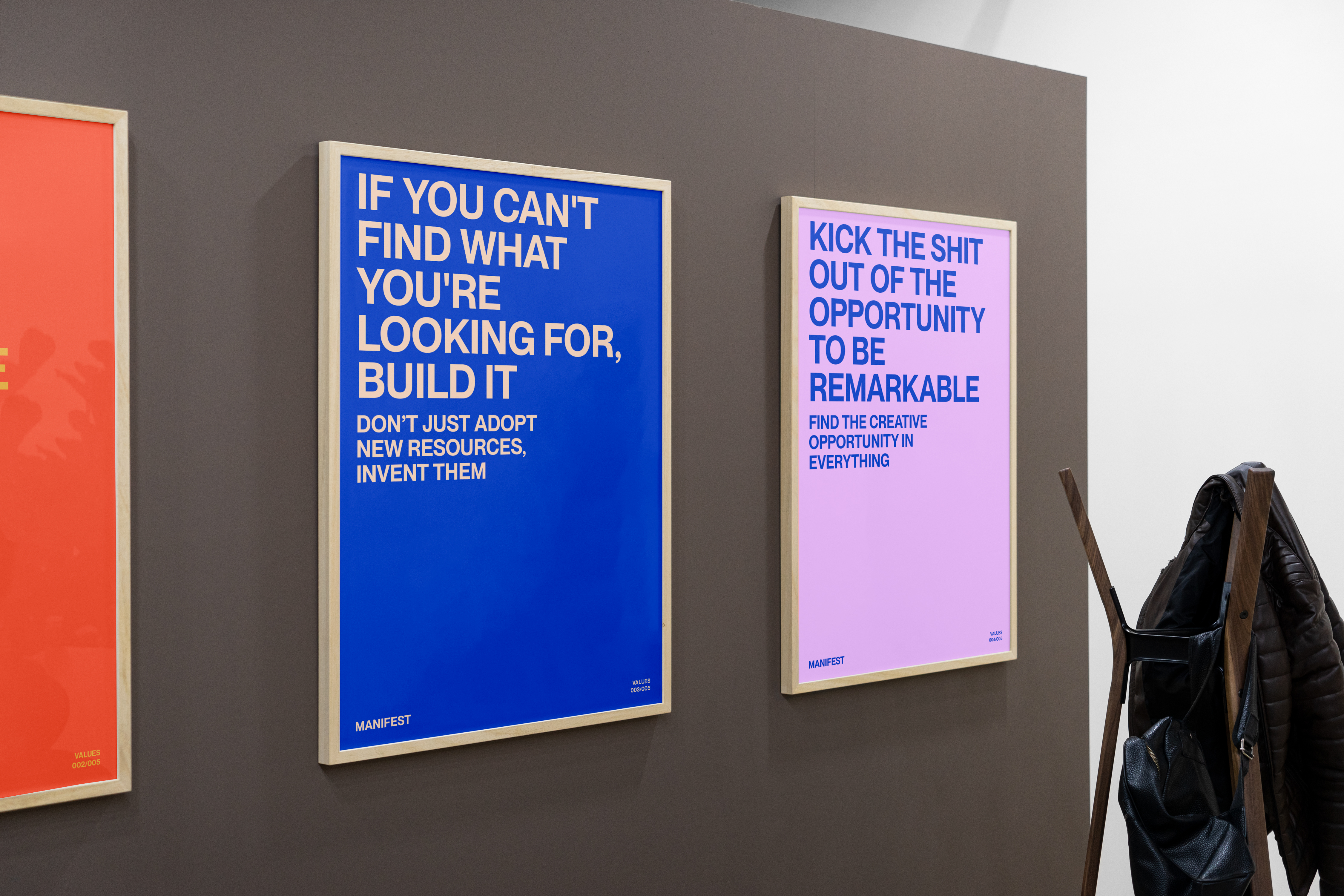
Values
It’s always worth sharing our values on social. We’ve created individual short videos on each which can be posted separately or as a carousel.
8.2.3 Recruitment
General
This asset can be used to advertise single or multiple roles or just as a general push for when we’re on the look-out for fresh faces.
Multiple Roles
Feel free to mix up the colors as you see fit.
These assets have been designed as global facing but can be localised if needs be.
Single Role
Use this if there's a single vacancy for a local studio
8.2.4 Seasonal
Seasonal assets will change to suit each day it commemorates - just give the design team enough notice to work something up.


8.2.5 Awards
Nominations (Structure)
Award assets have a consistent type layout that can flex depending on the number of nominations we get from an awarding body.
Use different structures to suit the amount of nominations
Note: It’s always best to check with the awarding body if there are any official assets to use. Sometimes these are quite nice and can break up our grid a little.


Award Win (Structure)
Award Win assets follow the same structure but the layouts are slightly different.
Use different layouts to suit the awards won.


Other Ratios (Structure)
Use the 1:1 layout on other ratios, sitting bottom / left.

Examples
Content can be static or motion. For agency nominations the default content should be from the awarding body but if that’s not suitable, use general Manifest brand or footage imagery.
We’ll sometimes create different assets depending on timeframes and importance of the award or we’ll experiment with motion assets too.
8.2.6 New Client Announcements
We use the Manifest x Client collab lock-up as per the sizing instructions.
You can, like with creds and pitch decks, remove the client logo and position branded photography in its place as per the example.


8.2.7 Events
Owned
Owned Events will evolve in look as we go forward but they will adhere a similar structure to these.

If required, the layout is flexible enough to be able to create speaker profiles too.

Appearing
If a Manifestee is appearing at an event, we’ll use these assets to promote it.
These can be used in isolation or as a carousel and can vary in appearance.

8.2.8 Thought Leadership
If we’re featured in an industry publication, our social support assets look like this.
You can use a headshot or whoever has been interviewed or you could so relevant work instead.
The copy frame can be in any approved colourway.


8.2.9 New Starters
New starters will need to create a short Memoji video for the asset. Posts can include an official headshot (if available) or a photo the new starter is comfortable to share.
The subhead should change to suit the studio they’ve joined.
8.2.10 New Studios
These assets can be used to support the new studio sizzle reels we create when opening in a new location.
This first asset should be used as a teaser before we have an official announcement.
This second asset style could also be used for major studio moves, not just new opens.
If we have footage of the new premises, use that over anything else.
8.2.11 Coverage
Coverage content should be a little bit more curated than just screen grabs so try to avoid ad heavy sites.


Section 9
Earned Media Assets. Communicado Official.
9.1 Press Release

9.2 Brand Visuals
If a release needs a specifically designed asset, please task this with the design team, otherwise use one of the following brand visuals to support the release. Think of these like a corner flag from a football team’s official communication. These can also double up as social profile furniture.

Section 10
Internal Innovations. Tech stack & white label stuff.
10.1 Down—Low
The Down—Low is the name for Manifest's weekly internal emailer that keeps all our studios in the loop with what's going on globally.
Logo
10.2 Roger
Roger is the world's first creator owned network. Its unique model connects a diverse range of creative talent with forward-thinking purpose-driven brands.
10.2.1 Brand Identity Overview
10.2.2 Logo
The Roger logo consists of a Monogram and Masthead. They should be used independently. Please note, the Roger branding is currently in development and is subject to change / additional items.
Monogram
Masthead
10.2.3 Brand Imagery


10.2.4 Sales Deck

10.3 The Loop
The Loop is Manifest's
omni-channel campaign analytics framework. Please note, the Loop branding is currently in development and is subject to change / additional items.
10.3.1 Brand Identity Overview

10.3.2 Logo
The Loop logo consists of a Monogram and Masthead. They should be used independently.
Monogram


Masthead


10.3.3 Brand Imagery

10.3.4 Presentation Decks
Sales Deck

Reporting Template
(Can be found within the Sales Deck)

Section 11
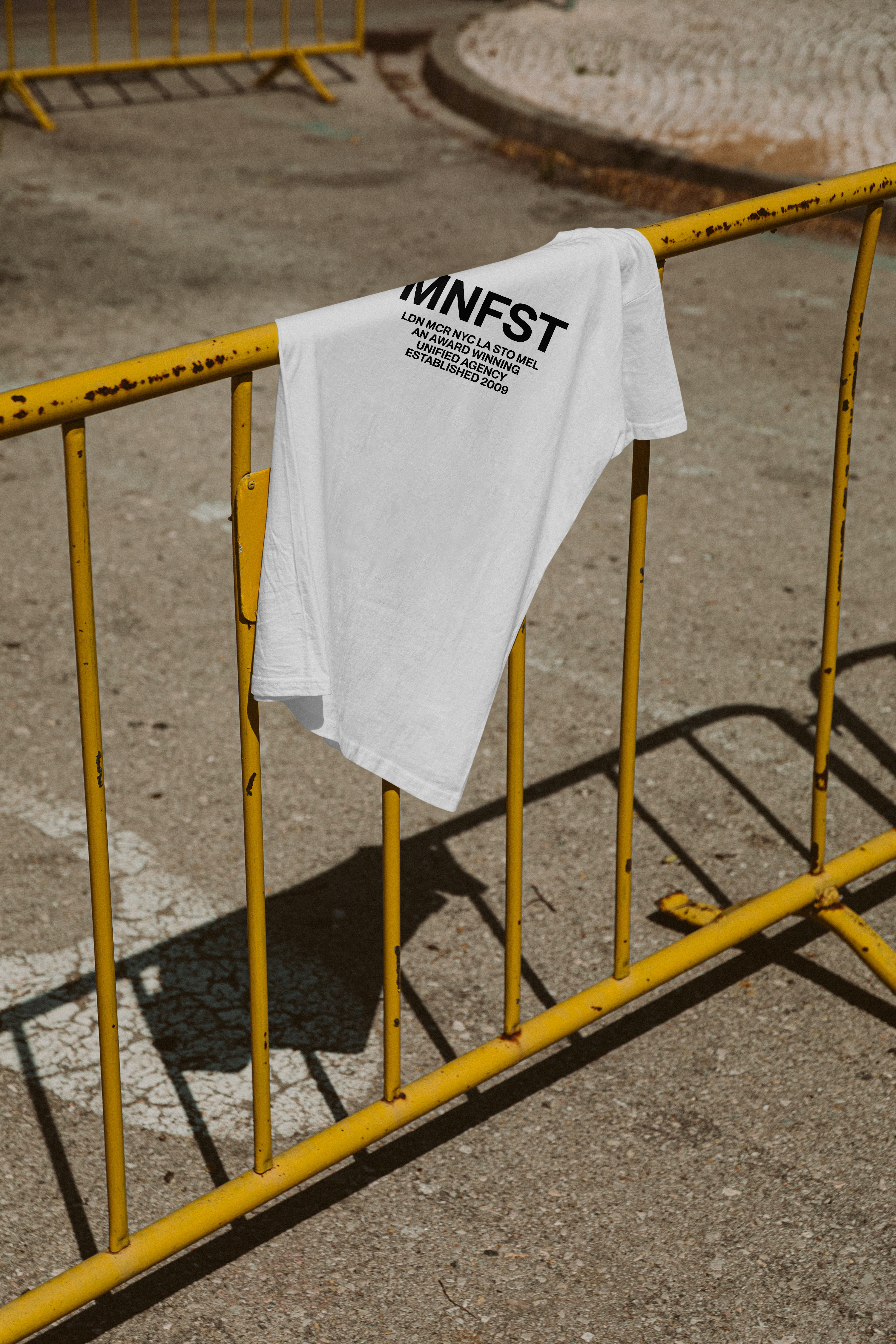
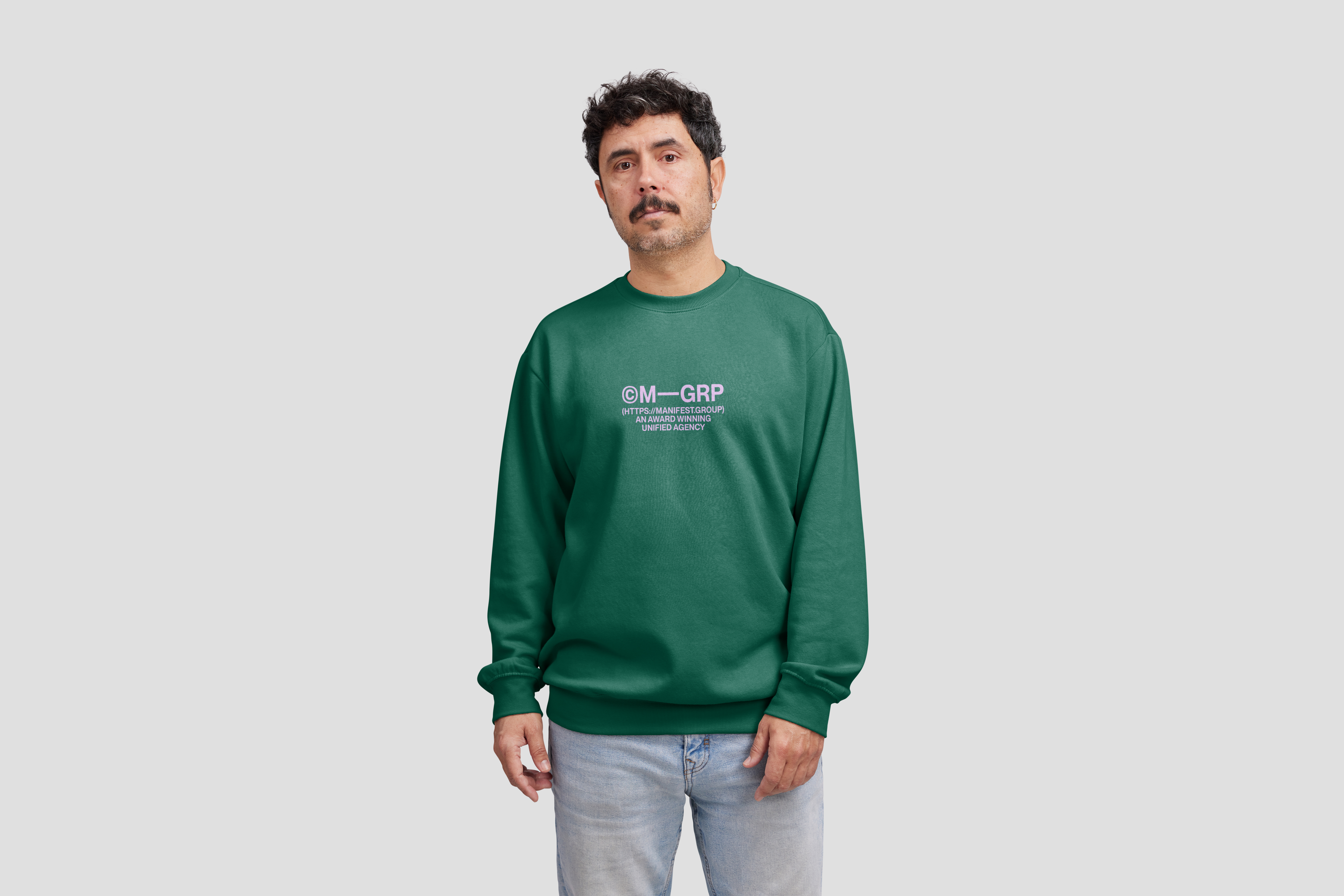
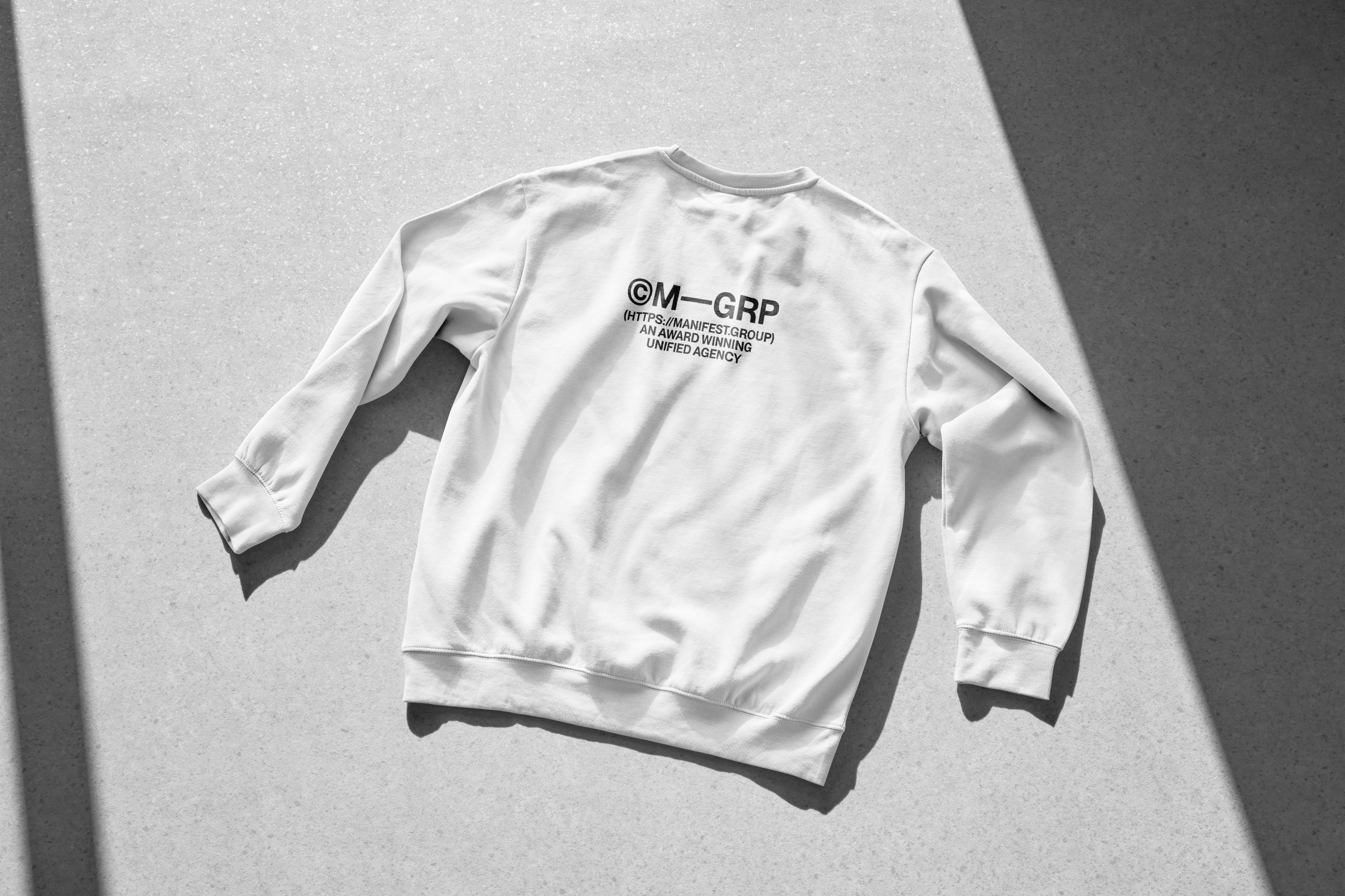
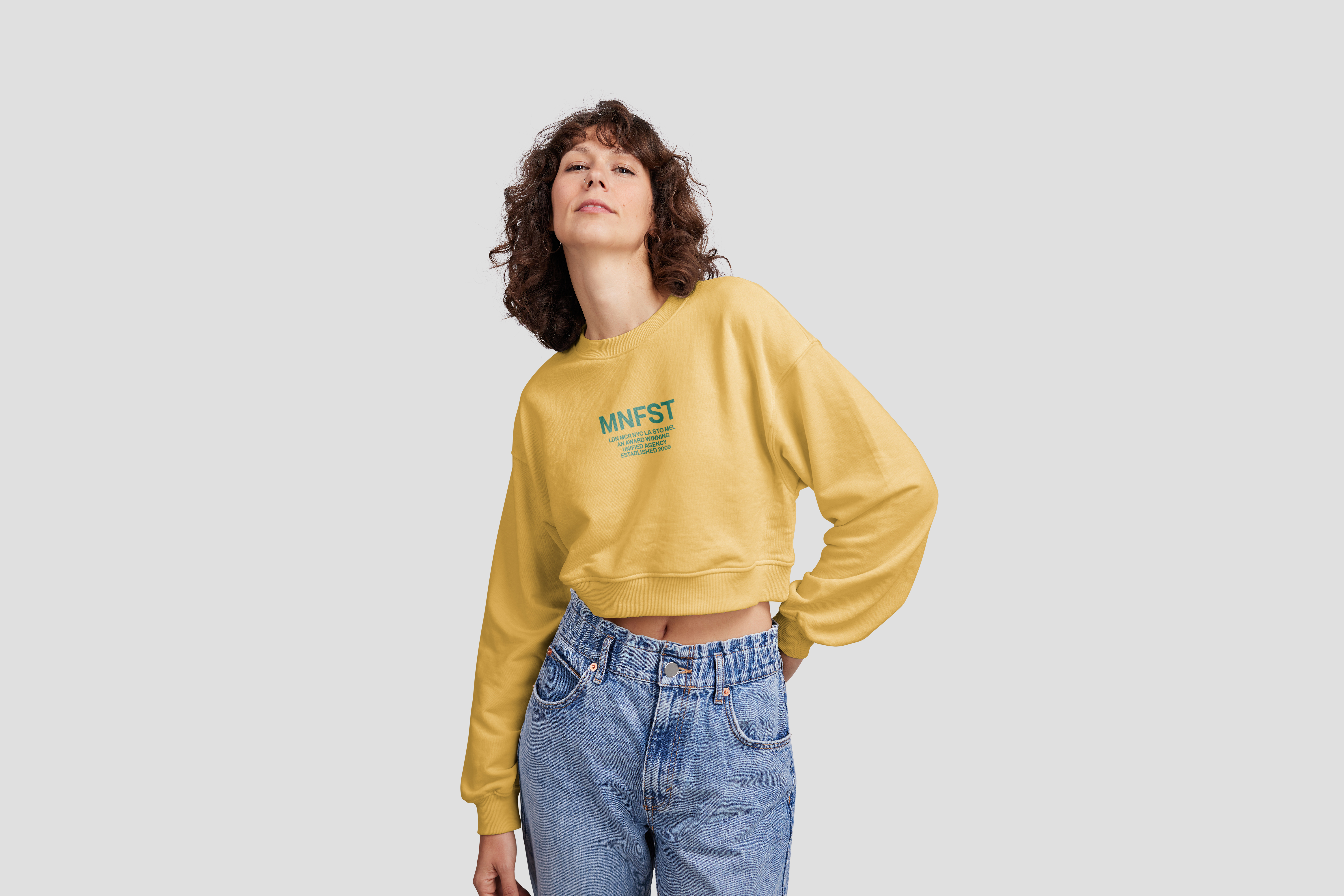
Swag & Merch. Fresh Manifest gear.
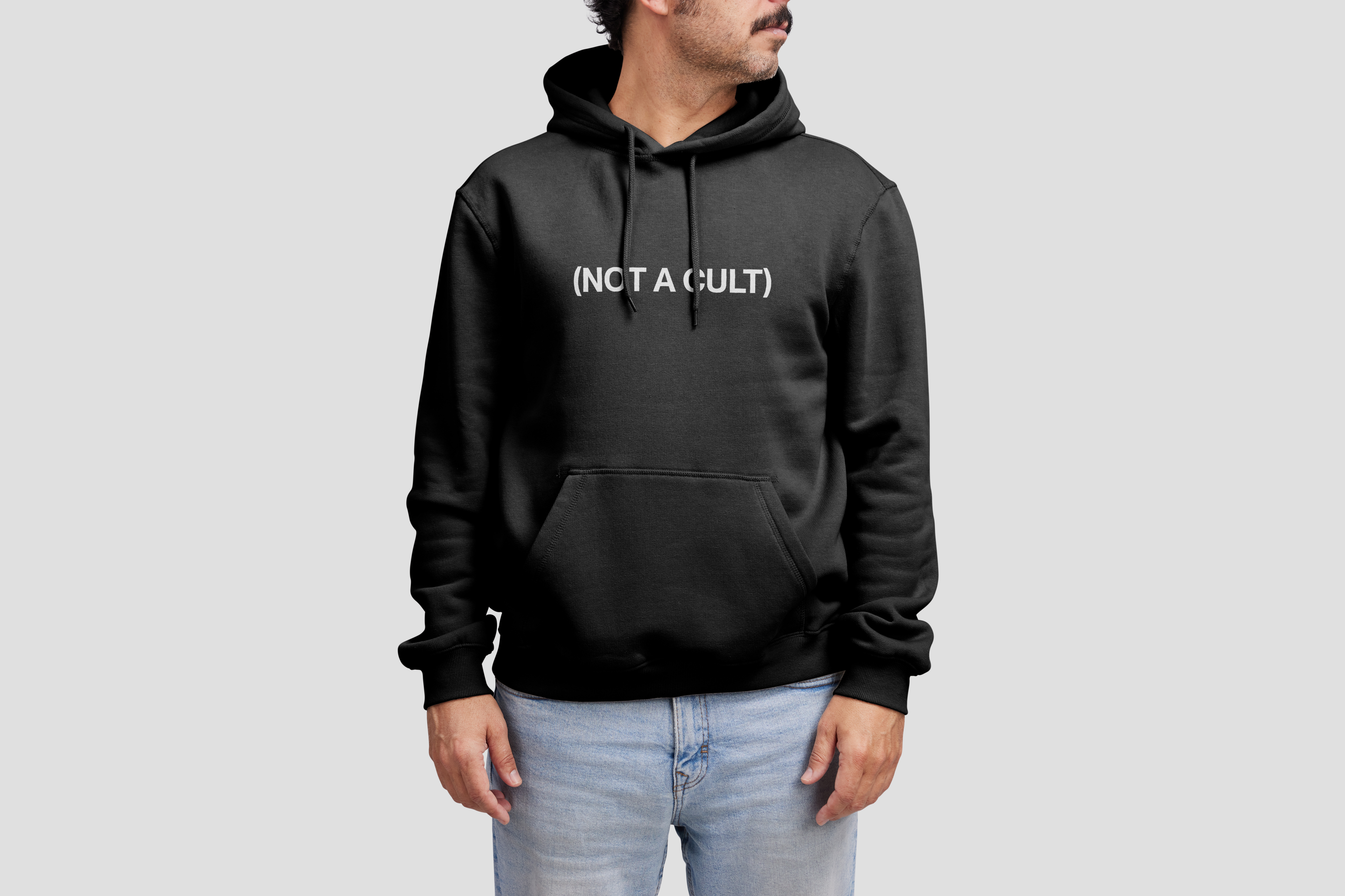
11.1 Clothing


11.2 Consumables


11.3 Posters


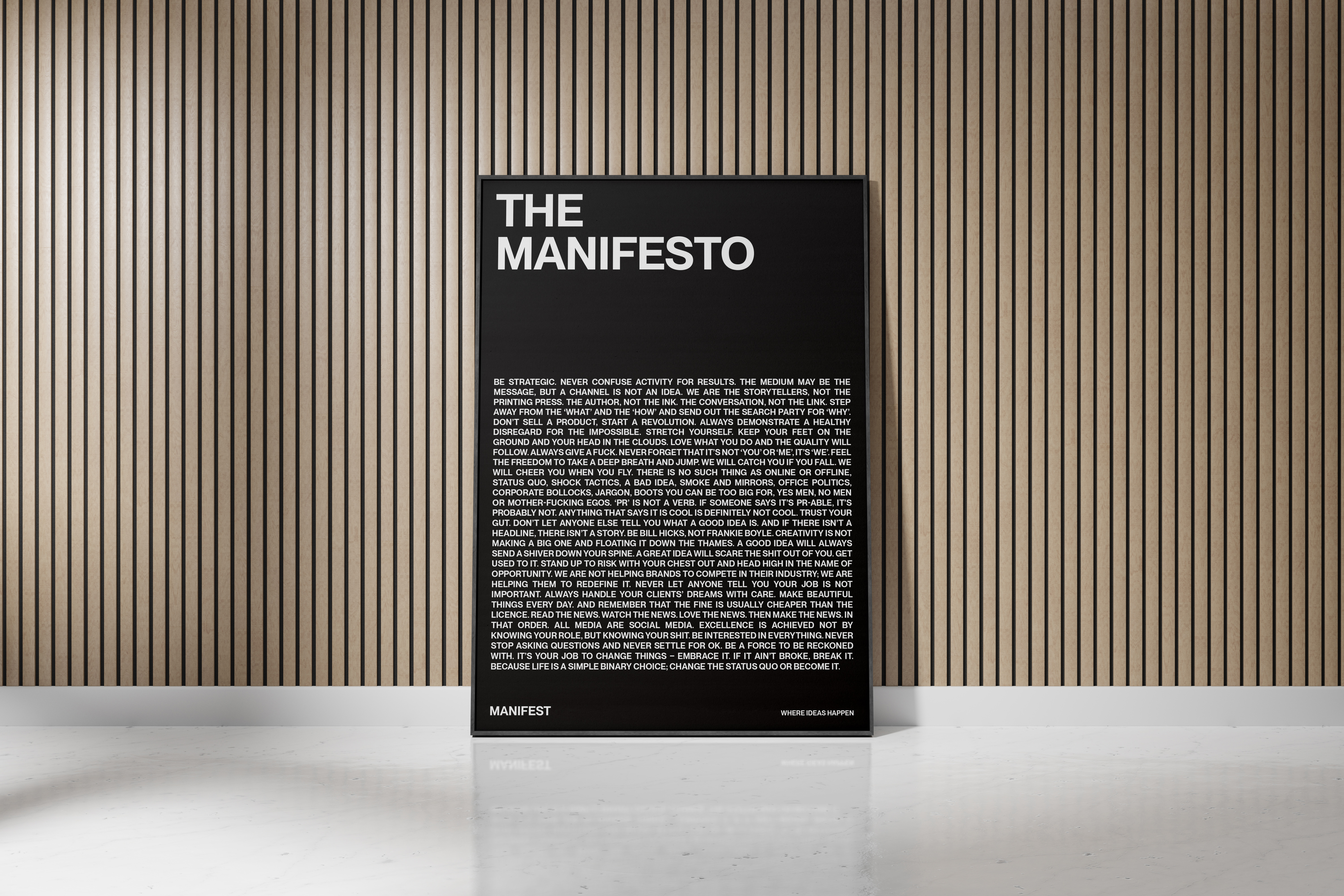
11.4 Sourcing & Ordering Swag
When ordering anything please aim to get the highest quality materials and finish possible - it’s not worth getting a cheap hoodie that shrinks on the first wash or fades from black to a crappy grey-ish brown. Also make sure that the supplier we’re using is as sustainable as can be and is either local or offsets their carbon output on deliveries. You might need to do a bit of research but it’ll result in better products.
Section 12
Brand in Action. Our brand brought to life.
12.1 Brand Visuals & Mockups
You should be able to find the majority of these images, high res, in the Brand Visuals folder (plus more when we add them)- if there’s something missing, please ask.
Business Cards
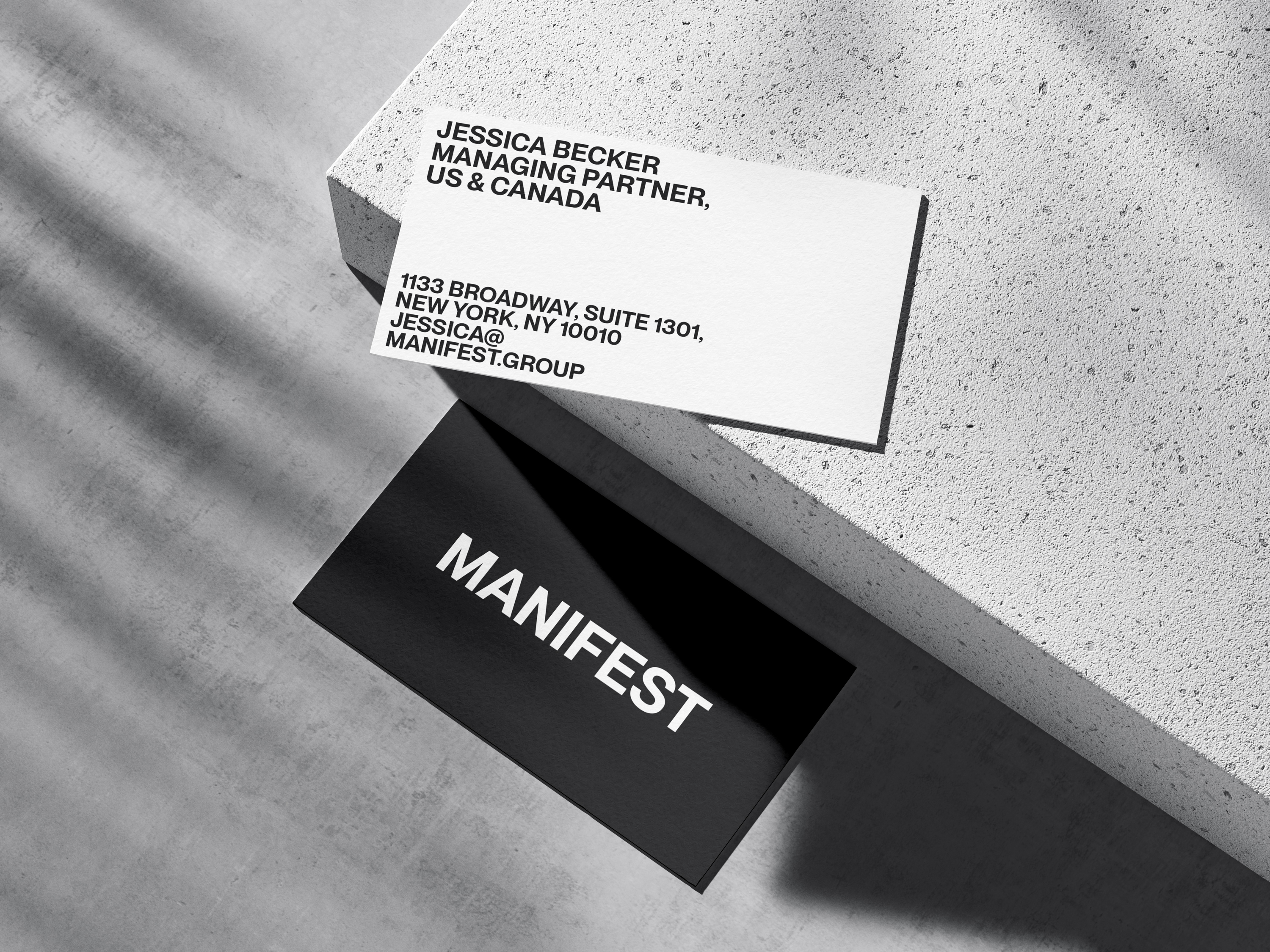

Lightbox
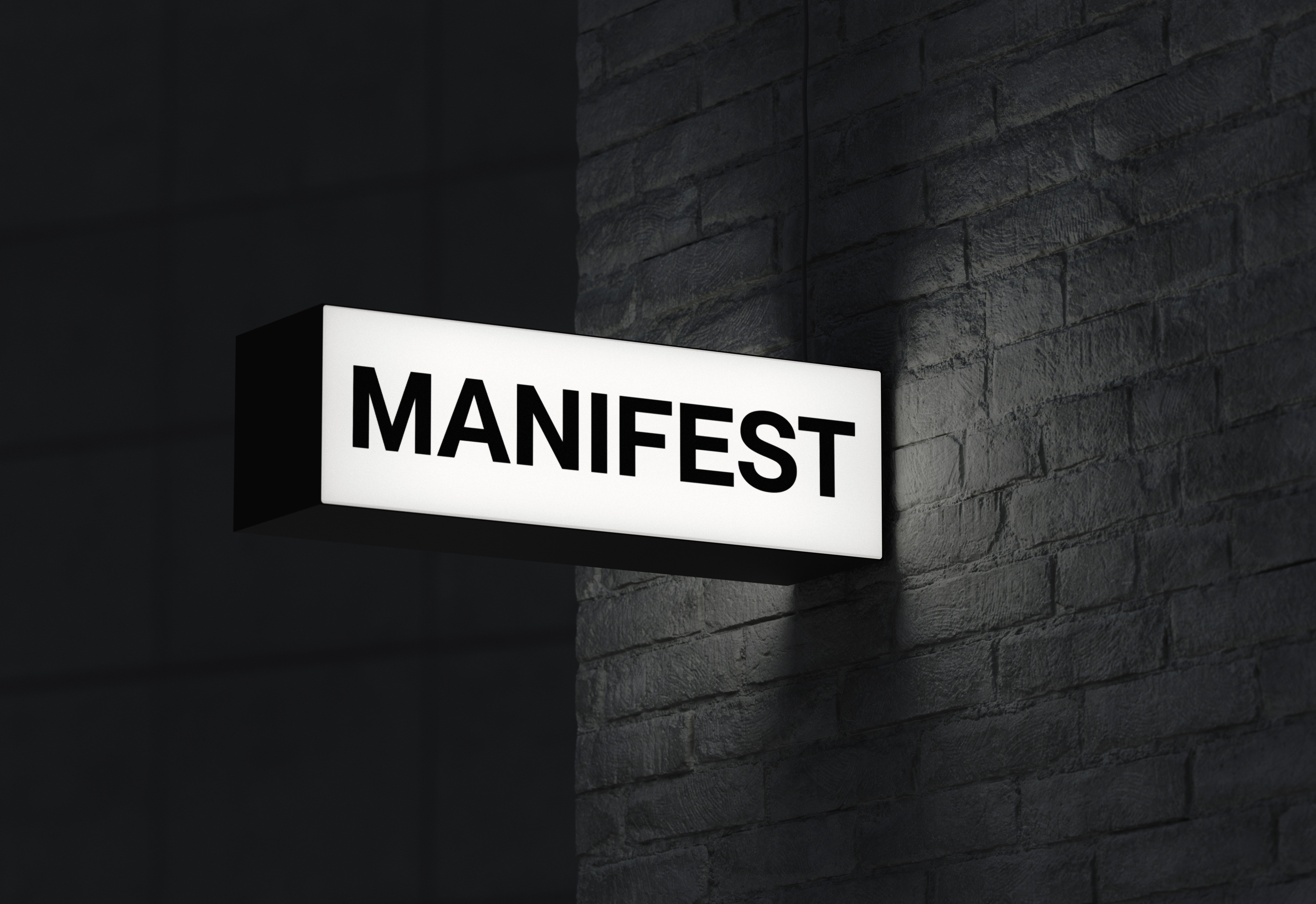


Flag
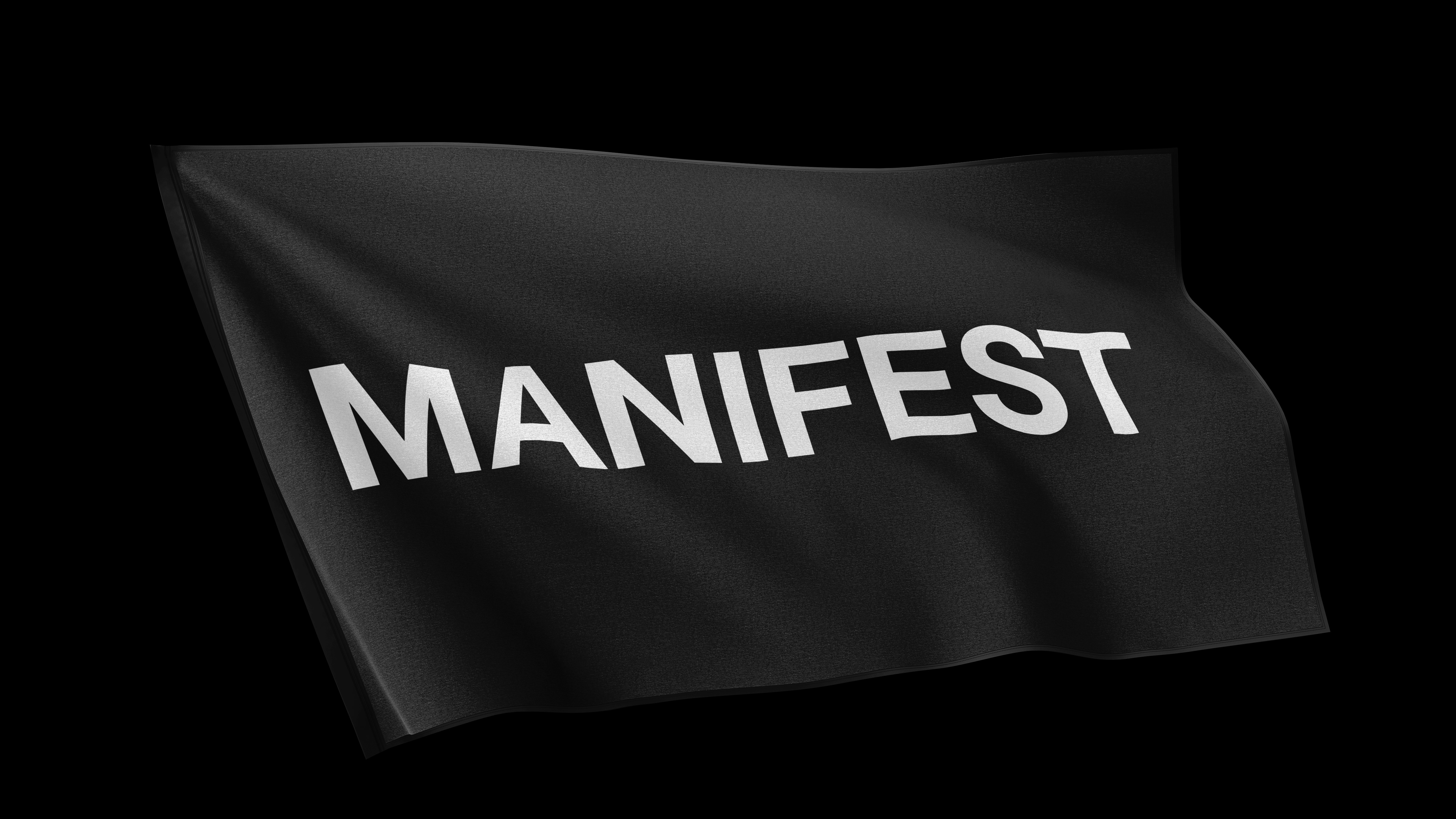

Letterhead
Poster
Posters

Tape
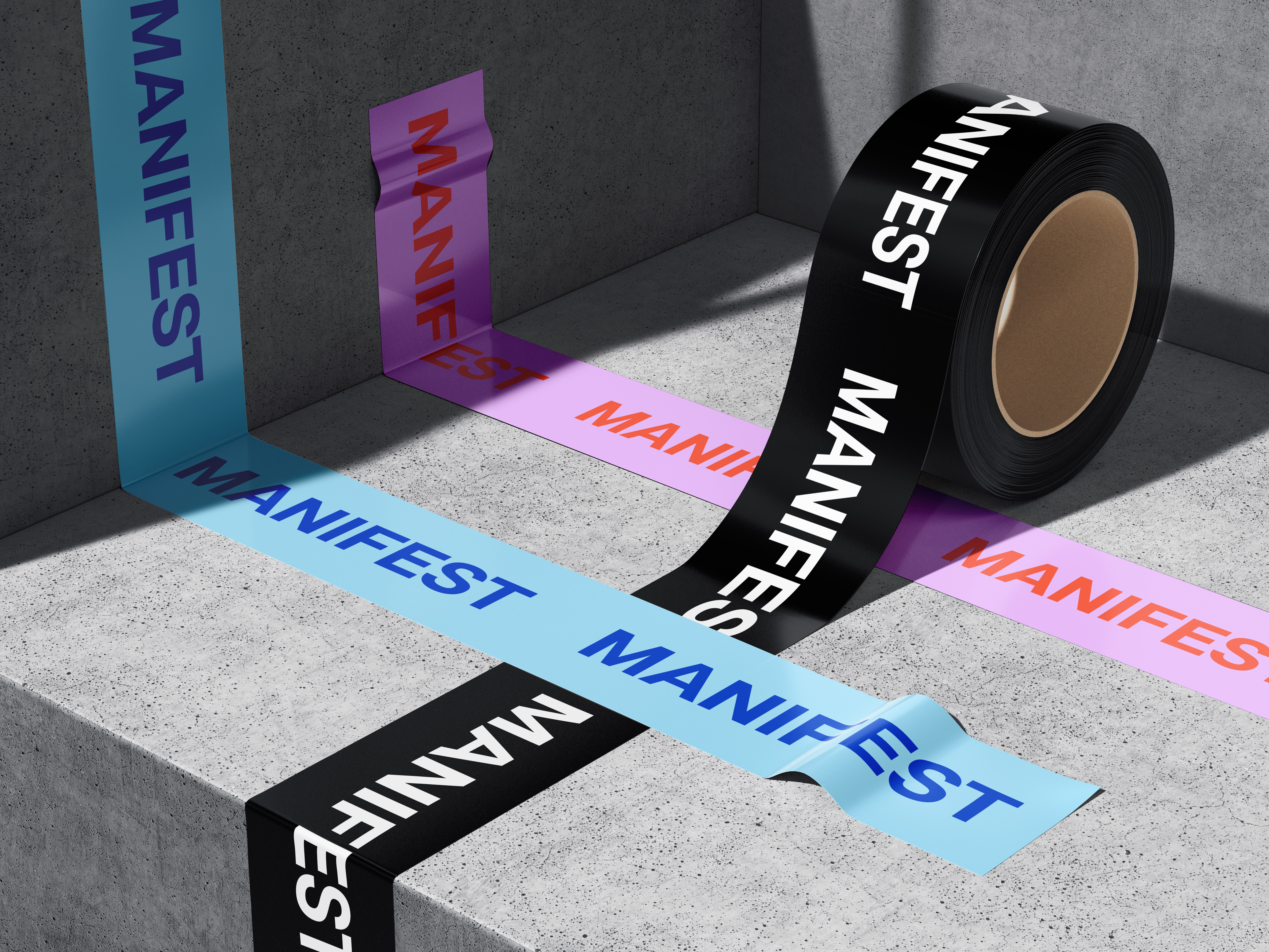

T-Shirt

Sweatshirt

Sweatshirt

Sweatshirt

Hoodie

Website
Window Signage


© Manifest 2024